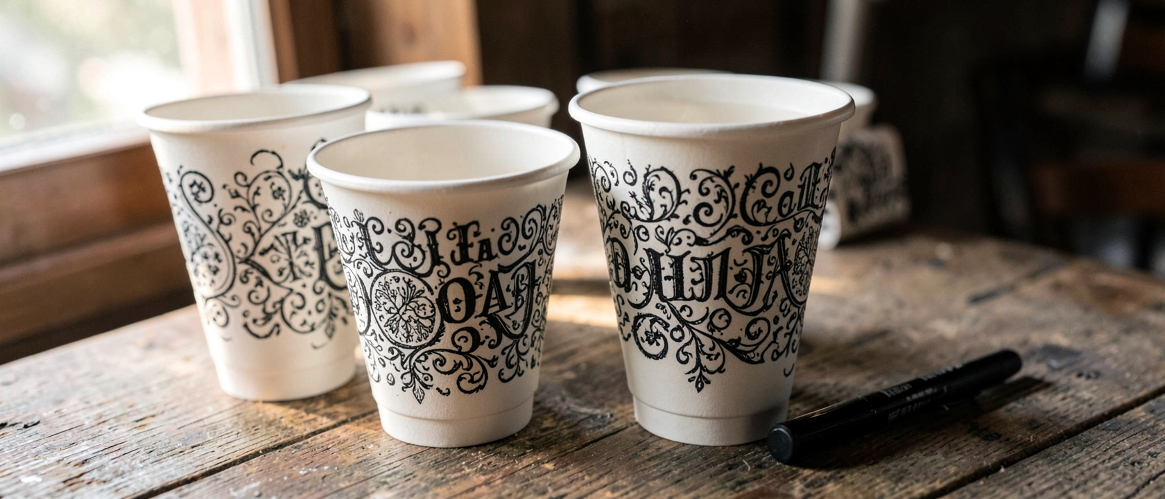
The Cup You Were About to Throw Away
Picture a paper coffee cup right after it’s been drained: crumpled rim, coffee rings on the cardboard, a few minutes from the trash can. Now picture that same cup with a clean line of lettering wrapped around its side, spelling out a joke sharp enough to stop you mid-toss. No canvas, no frame, no gallery wall, just the cup, exactly as it came off the café counter, moonlighting as a finished piece of art.
Why Would Anyone Look Twice at This?
Most people’s brains file a used coffee cup under “garbage” before it even touches the table. It’s one of dozens of small objects we stop seeing the moment we’re done with them. So what makes someone pause on the exact thing everyone else has already dismissed? That’s the real question here, not how the lettering was done, but what kind of attention notices a cup at all.
Meet Rob Draper: One Marker, Zero Studio
The person behind that shift is Rob Draper, a UK-based designer and illustrator who turned discarded coffee cups into an ongoing project called “Coffee Time.” By his own account, it started almost by accident: away from his notebook one day and unwilling to waste a good idea waiting for paper, he reached for the only surface actually in front of him, a disposable coffee cup, and started lettering directly onto it with a Sharpie.
There’s no hidden trick behind the work. No printing, no digital tools, just hand lettering, the same discipline behind sign painting and logo design, rendered in black and white with detail sharp enough to hold up on a crumpled, curved surface. One marker and one throwaway object are exactly what make the skill visible instead of hiding it behind expensive materials.
R Is for Refill: The Puns in Action
Draper builds jokes that work only because of where they’re written. “R Is for Refill” and “Always Cry Over Spilt Coffee” are two standout lines, and each one depends on its surface: read as plain text, they’re decent puns; hand-lettered on an actual used coffee cup, they land like a tiny punchline. Some pieces follow an alphabet pattern, like “E Is for Espresso,” turning the series into a running gag built one cup at a time. The lettering style does its own work too: bold, chunky letterforms, instantly readable, matched to the playful tone of each joke.
No Budget Required
What makes “Coffee Time” worth remembering isn’t the materials, because there barely were any: a marker, a few spare minutes, and a cup most people would toss without a second look. Draper has described his own fascination as making something out of nothing, giving a “trash bound” object a possible second life, and finding something funny in spending real time on something so disposable. This suggests good art doesn’t require expensive tools. The scarce ingredient was never the pen, it was the decision that the cup was worth a second look. That decision traveled further than a napkin sketch ever could: once Draper published the lettering online, the project grew, in his own words, “exponentially,” eventually inspiring a line of double-walled ceramic cups carrying his designs, sold worldwide before selling out.
What We Don’t Know, And Why That’s Part of the Charm
Plenty about “Coffee Time” stays open. There’s no count of how many cups make up the full series, no clear sense of how it fits into Draper’s wider body of work, and no record of where it was first shown publicly. The earliest documented write-up traces to June 3, 2014, when Neatorama writer Susan Petry covered it, crediting Design Taxi as the original source and noting Cheeming Boey as another artist long known for illustrating coffee cups. A publication date isn’t a creation date, though, and a project built entirely on objects meant to be thrown out within the hour was never going to come with a tidy archive. A series about giving disposable things a second life was never going to sit still long enough to be fully catalogued either.