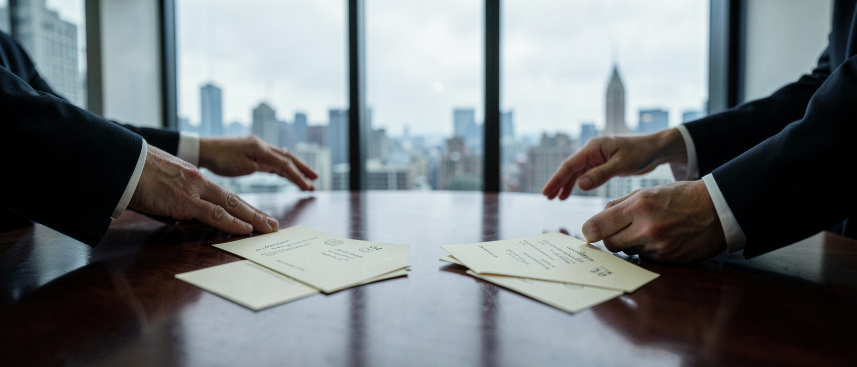
The Scene Everyone Remembers
In American Psycho (2000), there’s a boardroom scene at Pierce & Pierce where four Wall Street men pull out business cards and try to quietly outclass each other over paper stock and lettering. Patrick Bateman, played by Christian Bale, watches with real dread. The exchange runs about three minutes, though the cards themselves are visible for only about four seconds total.
That was apparently enough. Design blogs and typography fans have spent years holding this scene up as a masterclass in visual status anxiety. Which raises an obvious question nobody seemed to ask: are the cards actually well made?
Someone Actually Checked
A small letterpress printing shop in Chehalis, Washington, called Hoban Cards decided to find out. Letterpress is an older printing method where type is physically pressed into the paper, leaving a slight impression, and it’s exactly what the shop does for a living. They treated the film’s cards, all five that appear on screen, the way they’d treat a paying client’s job.
What the Experts Actually Found
The results weren’t kind. Bateman’s card, on cream “bone” stock, is the only one of the five genuinely letterpress printed, tilt it and you can see the impression. But the text isn’t centered; it sits shifted left and a bit too low, the kind of alignment slip a real shop catches before shipping.
Paul Allen’s card looks pricier at a glance, set in Copperplate Gothic, the same typeface used in the film’s opening titles. But it’s not letterpress at all, just flat, conventionally printed, likely offset, the standard 1980s method that lays ink on paper instead of pressing into it. There’s no impression and no watermark, despite the textured stock suggesting otherwise.
Everyone in the room shares one mistake: every card misspells “Acquisitions” as “Aquisitions.” Timothy Bryce’s card claims raised lettering but has none, printed flat in what looks like Helvetica. None of this is stylistic, it’s exactly the kind of error a professional print shop exists to catch.
The Novel Was Never Trying to Be Accurate
None of this can really be called “wrong” against a correct original, because the original never existed. In Bret Easton Ellis’s novel, Bateman’s card uses a typeface called “Silian Rail”, not real. Van Patten’s uses “Romalian,” also invented.
The film’s designers had to translate fiction into something printable, picking real fonts that felt close: something Garamond-based for Bateman’s card (some typography fans argue it’s actually Sabon Bold with old-style numerals), and a Bodoni-style face for “Romalian.” There was never a correct answer to hit, just a guess dressed up as confidence.
The Joke Was Already in the Script
Knowing this makes the scene land harder, not softer. These are men who measure their worth in paper weight and font choice, and the objects they’re so proud of are inconsistently printed, misspelled, and in one case not even letterpress. One online commenter summed it up: the cards are dull, and the men obsess over them because they are dull too, mistaking obsession for importance.
Director Mary Harron has said reusing Copperplate Gothic from the title sequence on Paul Allen’s card was deliberate, a quiet joke. The misspelling wasn’t planned the same way, Harron has said that part was an accident, but it fits so well it barely matters. A movie about hollow status symbols turns out to have literally hollow ones on the prop table.
This Became a Whole Hobby
Hoban Cards didn’t stop at Wall Street. They’ve since letterpress-printed cards for other fictional characters too, including Dwight Schrute, Kim Wexler, Veronica Mars, Lester Freamon, Lester Nygaard, Elizabeth Bennet, Peggy Olson, and Darryl Dixon, all posted to their Instagram as an ongoing side project.
So next time that boardroom scene comes up, share the better detail: the missing watermark on Paul Allen’s card, or “Acquisitions” misspelled on every card in the room. That’s what happens when someone finally looks closely.